Undercard Group
insurance
- UI/UX Strategy and Design
- Website Development
- Support & Maintenance
- Hosting
The Client
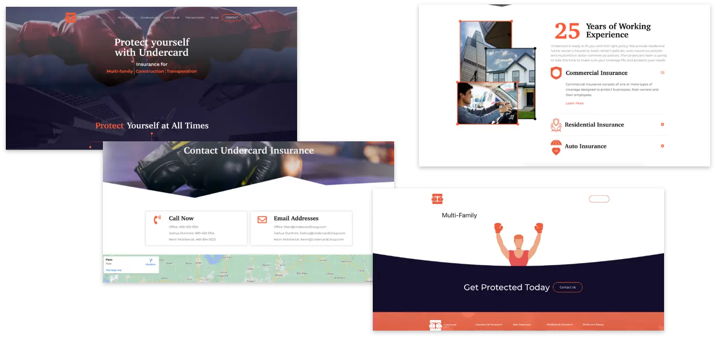
Undercard Group came to Falkon in need of a new, more professional website. Their old site was unfinished, lacking content, strategy, and a clear design aesthetic. They desired a website that better expressed their personalities and provided more information about their insurance product offerings and options.
Before...
The Challenge
Navigating the world of insurance can be a complex and overwhelming process. With an abundance of options and numerous websites to visit, requesting and receiving quotes online can be time-consuming. Attempting to contact insurance providers via phone often results in lengthy wait times, followed by confusing jargon that only adds to the already existing confusion about the coverage details.
Project Goals
- Update website to be more professional, fun, and informative
- Re-vamp aesthetic to be more modern with more appropriate photography
- Present Undercard as easy to work with, responsive, and legitimate
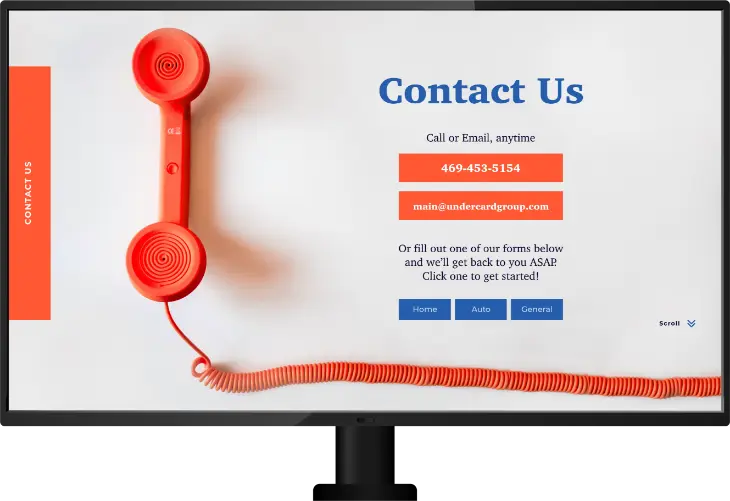
- Provide visitors with options to receive their quotes, no matter their preference: Call, Text, Email, Submit a Form
Our Solution
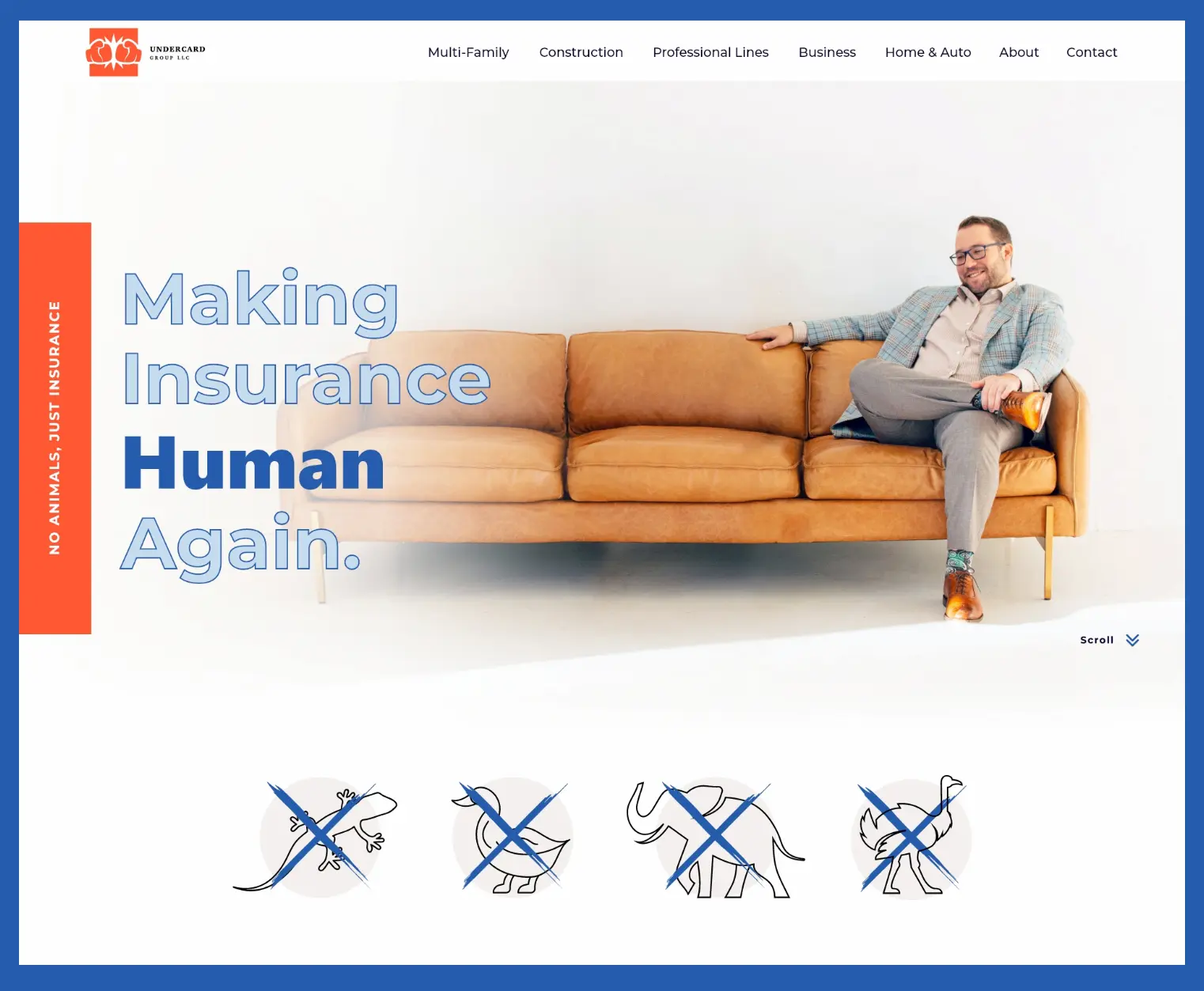
Undercard Group is making insurance human again. With numerous product offerings and their punny and true human approach, they’re bringing a fresh attitude to the insurance industry.
Understanding: Upon thorough analysis of their existing website and understanding the client’s pain points, we identified that the most significant improvements would come from not only from addressing various bugs but also from adopting a fresh tone of voice. A central aspect of our strategy was updating the website’s content to use less jargon, and enhance its overall clarity and accessibility to a wider audience.
Branding: The core essence of the brand remained unchanged. However, we skillfully blended a laid-back and personalized tone that resonated with the managing partner’s delightful mix of humor and professionalism. This allowed us to sidestep the cliché of using animal mascots, opting instead for a more human-centric and enjoyable brand identity, while playfully injecting a touch of humor.
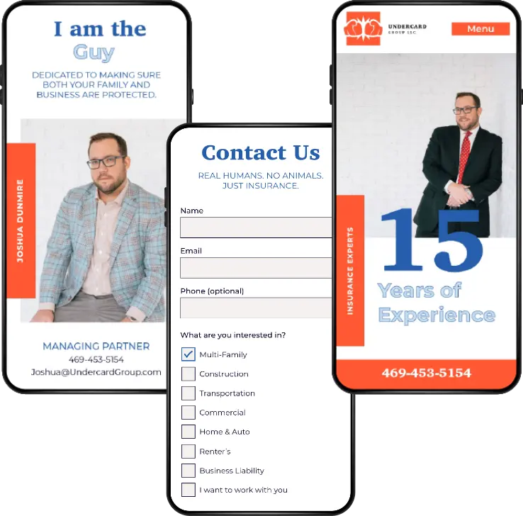
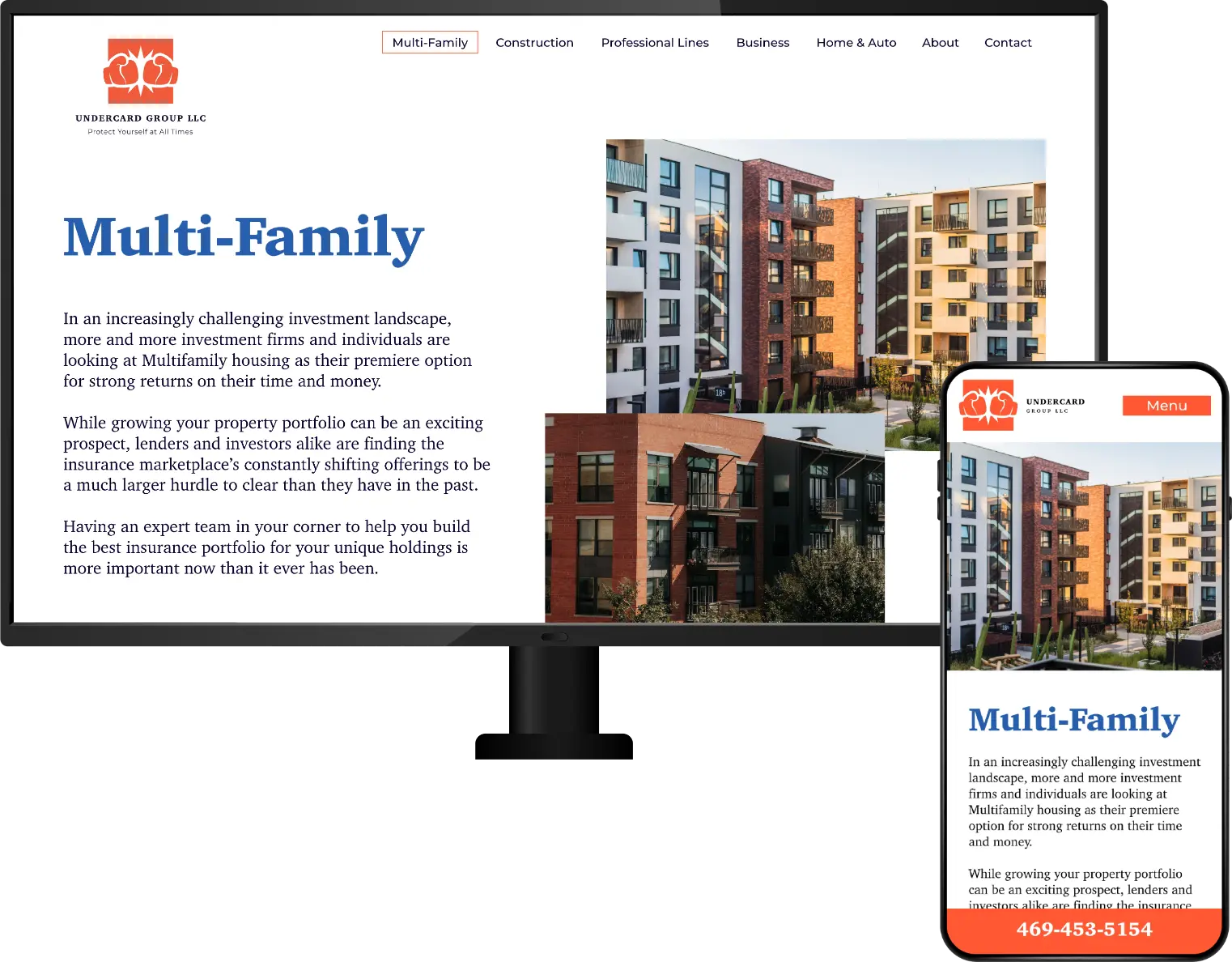
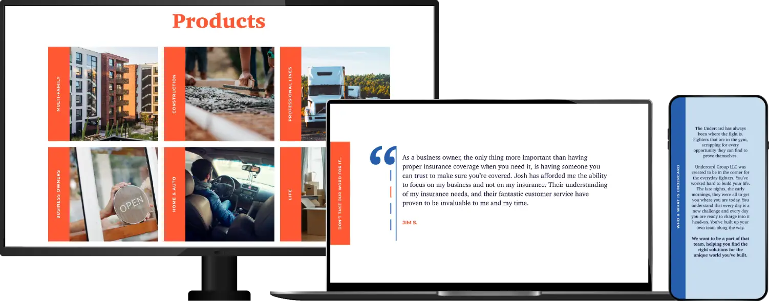
UI/UX: During the website design process, our goal was to playfully parody the animal mascots commonly used by insurance agencies, while ensuring the spotlight remained on the managing partners’ human touch. Additionally, we curated relevant and fitting photos for each insurance package, arranging them in order of their specialty.


The Outcome
In the end, Undercard was overjoyed with a revamped site that highlighted who they are and what they offer, providing various options for visitors to receive quotes, whether through call, text, email, or form. The brand tone and image were aligned with the two managing partners, injected with humor and personality that differentiates them from the competition, and makes insurance feel more human. The revamped website boasts a modern look and an easy-to-understand tone, expressing the professionalism, playfulness, and uniqueness of Undercard Group.
Awards
This website won 3 awards from CSS Design Awards: Best UX Design, Best UI Design, and Best Innovation. This website also won the 2023 American Digital Design Award from Graphic Design USA.


Falkon has done such a good job with our website that we will never be looking anywhere else. We even had to have some revision requests for compliance sake that needed to be done in 2 weeks. Jenna knocked it out in 48 hours. I cannot thank Falkon enough for their white glove hands on approach and expedient delivery.
Joshua Dunmire, Managing Partner Undercard Group

Did this inspire an idea?


